This is the first in a series of how-to with Tailwind, looking at how you can spice up your designs without too much effort.
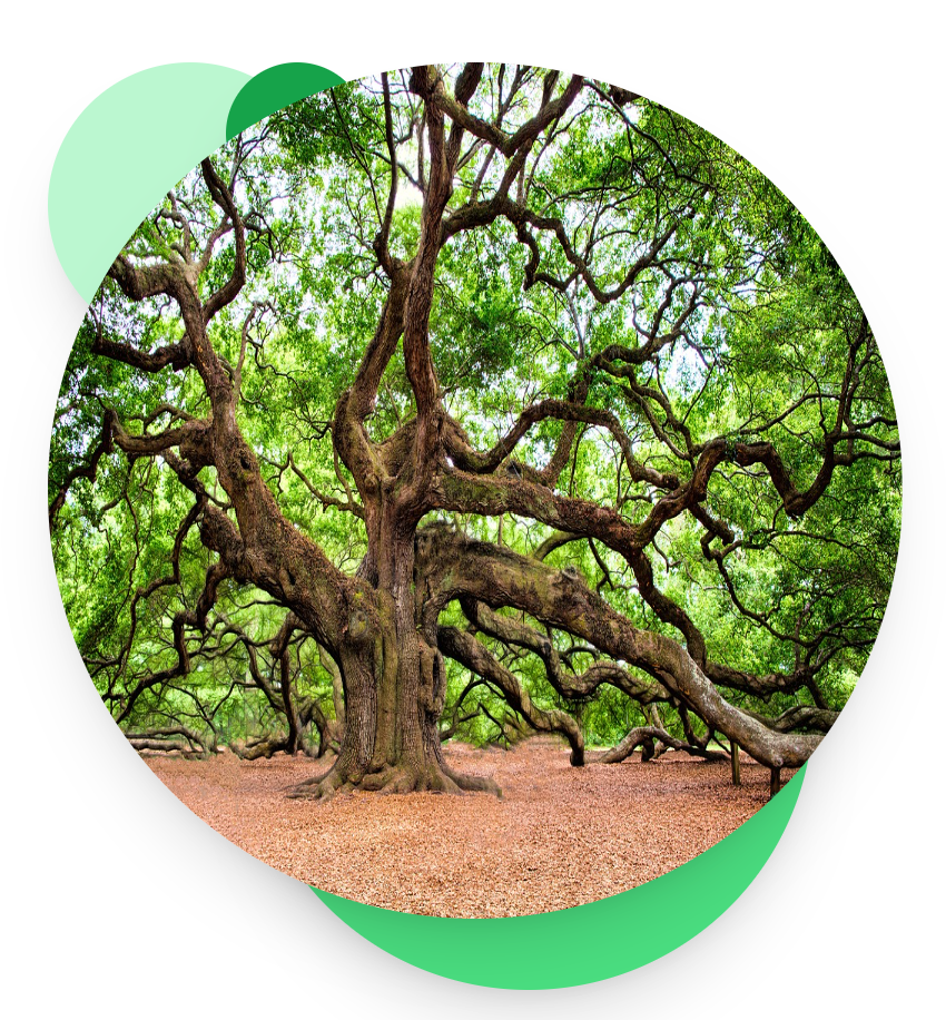
The effect we are going for is enhancing a circular image with some circles. This is ideal for a landing page image in a hero section or feature list. It could also be used as your feature image for a blog post.
Here is an example, and this is what we will be building today:
The way to tackle this in CSS is to use position:absolute. Absolute positioning allows you to take elements out of their normal flow, and position them based on their containing element. In Tailwind CSS, you just use the class absolute, which does the same thing.
The circles will be absolute-positioned, so we can control their position precisely. But what does this look like in HTML and Tailwind CSS?
How to make the circles effect in Tailwind CSS
There are a few ways to set this up. I will go with a very simple way.
You start off with a containing DIV element and set its size. Now you have effectively an empty canvas to pin the circles onto:
<div class="relative w-96 h-96">
</div>
The relative class is used here because otherwise the div will not be used for the absolute positioning of the children, and instead it will use the viewport – so your circles will be all over the page! If you are interested, see the rules about position.
You need that containing element to have a size – you can either set its width and height, or set the image size to cause the div to have that size.
Now let’s add the 3 background circles:
<div class="relative w-96 h-96">
    <div class="shadow-xl absolute w-32 h-32 bg-green-200 rounded-full "></div>
    <div class="shadow-xl absolute right-10 -bottom-8 w-64 h-64 bg-green-400 rounded-full "></div>
    <div class="shadow-xl absolute -top-50 left-20 w-16 h-16 bg-green-600 rounded-full "></div>
</div>
The circles are created using CSS using rounded-full which creates as a big border radius as possible, and when the width and height are the same, this means a circle! You could also use an inline SVG image, but if you just need a circle (and not too many of them) this is a good technique.
As expected, each one has the absolute class, so no surprise there.
The top/right/bottom/left attribute position the div relative to the outer div, using the Tailwind units, which are equivalent to 1 unit → 0.25em by default.
Finally, there is some shadow-xl to make it look cool!
So far, we get this. I added a border for this image to show where the outer div takes up space:
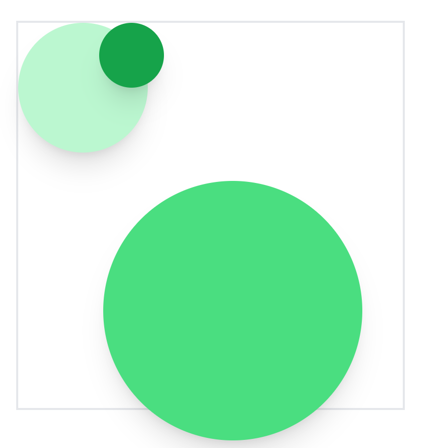
Notice how the bottom right circle actually pops out of the area. This is possible, and it will probably cover content below it. So you need to take that into account, or make the circle a bit smaller.
Finally, let’s add the image. The trick here is to use positioning, even though we don’t want to reposition it. The purpose is to ensure that it is shown above the other circles, and if it isn’t a positioned element this will not happen:
<div class="relative w-96 h-96">
    <div class="shadow-xl absolute w-32 h-32 bg-green-200 rounded-full "></div>
    <div class="shadow-xl absolute right-10 -bottom-8 w-64 h-64 bg-green-400 rounded-full "></div>
    <div class="shadow-xl absolute -top-50 left-20 w-16 h-16 bg-green-600 rounded-full "></div>
    <img src="https://cdn.pixabay.com/photo/2017/01/29/17/36/oak-tree-2018822_1280.jpg" class="relative w-full h-full rounded-full shadow-xl">
</div>
And that is it! That is how you create a funky circle image effect with Tailwind CSS.
To help me create the Tailwind classes for this, and experiment with the design more quickly, I used LangCSS. If you want to try it out, try the demo.